
In the month of April, we have made several improvements to the dashboard that make it even easier for cities to understand and manage their micromobility programs. Self-draw Areas of Interest (AOIs) allow cities to explore and understand micromobility behavior in custom geographies, while multi-metrics line charts in the Analyze tab enable cities to compare and normalize multiple metrics in the same chart.
Read on to learn more about how these updates help cities better utilize their program data.
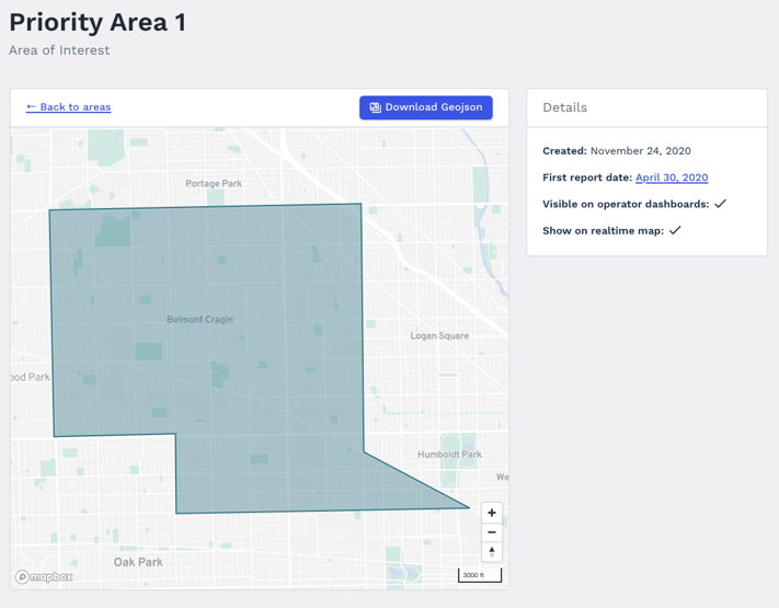
The use cases for these metrics are endless! Cities can use this tool to track the effectiveness of a no parking zone, explore the expected value of a potential new per-trip fee area, track the utilization of a new parking corral, or determine which hours would be most effective for doing field spot checks of sidewalk riding. This data is valuable for policy makers, planners, and program managers as they make informed decisions on program rules and infrastructure.
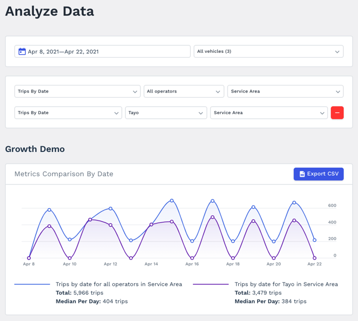
The ability to compare multiple metrics at the same time helps program managers and planners quickly understand patterns in their micromobility program data. Was that bump in trips due to an increase in vehicles or more ridership per vehicle? Are operators quickly removing vehicles from an equity zone after meeting a deployment requirement? This more robust feature allows you to quickly answer these questions and share the information in a way all stakeholders will understand.
Continued platform improvement
As always, Ride Report is working hard to make sure that our tools make micromobility management a breeze for our city customers. From small to major updates, everything is developed thoughtfully with privacy, data trustworthiness, and overall usefulness at the forefront of our minds.